Visualizing 2021
Seeing is believing.
Visualizing complex scenarios is a great way to understand them.
A proliferation of next-generation tools (including many from the open-source community) and know-how are helping us see the world differently. And while several publications are producing high-quality data visualizations, the FT's visualization efforts — led by its elegant showcasing of COVID's rapid spread — stood out in 2021.
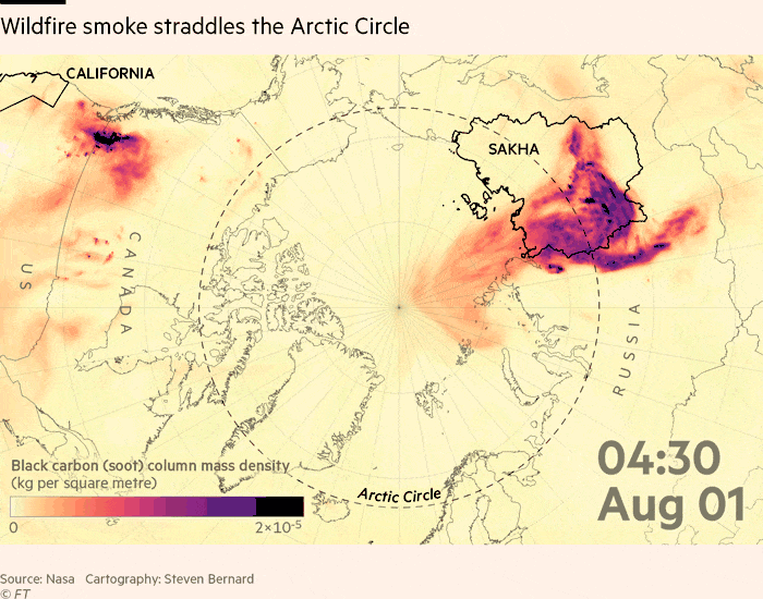
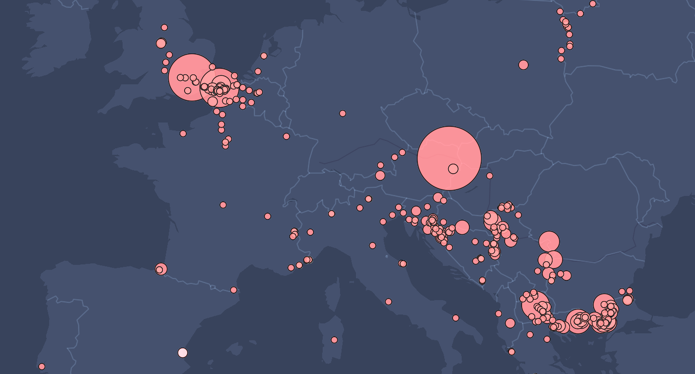
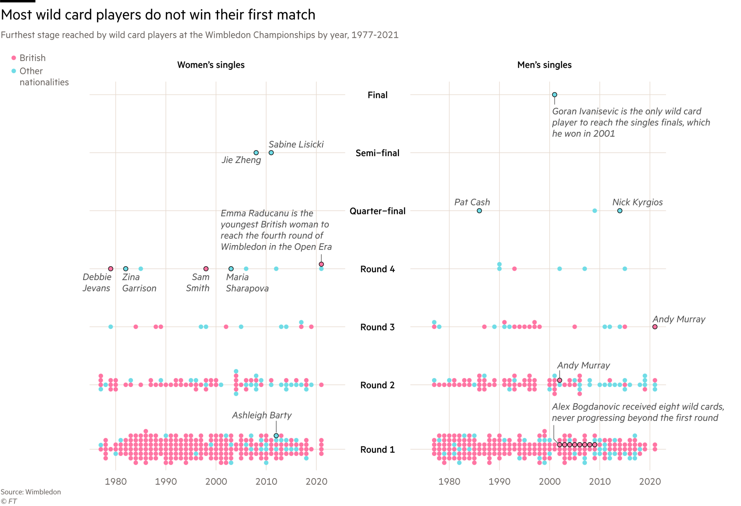
From wildfires to pandemics, energy flows to tennis matches, the good people in London just published its top graphics from 2021.
More from FT: Making Sense of 2021